
Scientific plotting for publication with OmicVerse#
In this tutorial, we focus on a practical question: how to make biologically accurate, visually consistent, and publication-ready figures when using omicverse.
This is not only an API tutorial. We will explain what to do, why to do it, and which mistakes to avoid when generating figures for manuscripts, preprints, and reports.
The core principles are:
figures should communicate biology before decoration
the same biological category should keep the same color across figures
panel size, font, resolution, and export format should be standardized early
continuous and categorical variables should use different color logic
final figures should be exported in both raster and vector formats whenever possible
import numpy as np
import pandas as pd
import seaborn as sns
import matplotlib.pyplot as plt
from matplotlib.colors import LinearSegmentedColormap

import omicverse as ov

# Optional: use a processed AnnData object from your own analysis.
# adata = ...

# OmicVerse provides convenient styling helpers.
ov.plot_set(font_path='Arial')
🔬 Starting plot initialization...
Using already downloaded Arial font from: /tmp/omicverse_arial.ttf
Registered as: Arial
🧬 Detecting GPU devices…
✅ NVIDIA CUDA GPUs detected: 1
    • [CUDA 0] NVIDIA H100 80GB HBM3
      Memory: 79.1 GB | Compute: 9.0

   ____            _     _    __
  / __ \____ ___  (_)___| |  / /__  _____________
 / / / / __ `__ \/ / ___/ | / / _ \/ ___/ ___/ _ \
/ /_/ / / / / / / / /__ | |/ /  __/ /  (__  )  __/
\____/_/ /_/ /_/_/\___/ |___/\___/_/  /____/\___/

🔖 Version: 2.2.1rc1   📚 Tutorials: https://omicverse.readthedocs.io/
✅ plot_set complete.
1. Start from a reproducible visual standard#
The first step in scientific plotting is not plotting. It is defining a reproducible visual baseline.
Why this matters:
If you tune font size and panel size manually for every figure, the entire manuscript becomes inconsistent.
If you save one figure at low resolution and another at high resolution, journal assembly becomes painful.
If you decide colors only at the end, you usually break consistency across embeddings, heatmaps, and spatial panels.
A good default for compact manuscript figures is:
single panel:
figsize=(4, 4)orfigsize=(3, 3)dense matrix or large embedding:
figsize=(8, 8)final export:
dpi=300crop white margins:
bbox_inches='tight'save both
pngandsvg
adata=ov.datasets.pbmc8k()
🩸 Downloading PBMC 8k dataset
Using Stanford mirror for pbmc8k
⚠️ File ./data/pbmc8k.h5ad already exists
 Loading data from ./data/pbmc8k.h5ad
✅ Successfully loaded: 7750 cells × 20939 genes
def set_publication_style(fontsize=12):
    plt.rcParams['figure.dpi'] = 80
    plt.rcParams['savefig.dpi'] = 300
    plt.rcParams['font.size'] = fontsize
    plt.rcParams['axes.labelsize'] = fontsize
    plt.rcParams['axes.titlesize'] = fontsize + 1
    plt.rcParams['xtick.labelsize'] = fontsize - 1
    plt.rcParams['ytick.labelsize'] = fontsize - 1
    plt.rcParams['legend.fontsize'] = fontsize - 1
    plt.rcParams['pdf.fonttype'] = 42
    plt.rcParams['ps.fonttype'] = 42


def save_figure_pair(stem):
    plt.savefig(f'{stem}.png', dpi=300, bbox_inches='tight')
    plt.savefig(f'{stem}.svg')
    #plt.savefig(f'{stem}.pdf')


set_publication_style(fontsize=13)
The helper above is written out so you can see what it sets. omicverse has
the same thing built in, and using it means one style rather than two: the
plotting functions read these rcParams instead of carrying their own defaults.
ov.pl.font_sizes() reports what the current settings resolve to, and
ov.pl.style_axes(ax) applies the frame convention the rest of ov.pl uses —
top and right spines hidden, the other two offset outward by 10 points.
ov.plot_set(fontsize=13)
ov.pl.font_sizes()
🔬 Starting plot initialization...
🧬 Detecting GPU devices…
✅ NVIDIA CUDA GPUs detected: 1
    • [CUDA 0] NVIDIA H100 80GB HBM3
      Memory: 79.1 GB | Compute: 9.0
✅ plot_set complete.
{'label': 13.0, 'tick': 13.0, 'title': 13.0, 'legend': 11.96}
# rc_context here only so the notebook does not reprint the whole banner;
# in a script you would just call ov.plot_set(fontsize=...) once.
for size in (9, 13, 18):
    with plt.rc_context({'axes.labelsize': size, 'axes.titlesize': size + 2}):
        print(f"plot_set(fontsize={size:>2}) -> label {ov.pl.font_size(None, 'label'):>4.1f}"
              f"   title {ov.pl.font_size(None, 'title'):>4.1f}")
plot_set(fontsize= 9) -> label  9.0   title 11.0
plot_set(fontsize=13) -> label 13.0   title 15.0
plot_set(fontsize=18) -> label 18.0   title 20.0
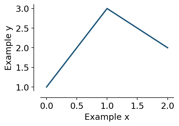
fig, ax = plt.subplots(figsize=(3.6, 2.4))
ax.plot([0, 1, 2], [1, 3, 2], lw=2)
ax.set_xlabel('Example x'); ax.set_ylabel('Example y')
ov.pl.style_axes(ax)
print("left spine:", ax.spines['left'].get_position())
plt.show()
left spine: ('outward', 10.0)
2. Separate categorical color design from continuous color design#
A common mistake is to use the same color logic for all figures.
This is incorrect because:
categorical annotations such as cell types, clusters, niches, and samples require stable named colors
continuous values such as scores, abundance, logFC, or expression require ordered colormaps
Purpose of this step:
make the reader recognize the same biology instantly across multiple figures
prevent visual misinterpretation caused by arbitrary remapping
improve comparability between panels
Recommended rules:
for cell types or clusters: build a dictionary once and reuse it everywhere
for abundance-like values: start with
Redsfor signed effects such as enrichment or log fold change: start with
RdBu_r
# Example: stable categorical palette.
# Replace 'cell_type' with your own annotation column.

if 'cell_type' in getattr(adata, 'obs', {}):
    categories = list(adata.obs['cell_type'].astype('category').cat.categories)
    palette = ov.pl.sc_color[8:] + ov.pl.red_color + ov.pl.orange_color + ov.pl.sc_color
    color_dict = {k: palette[i] for i, k in enumerate(categories)}
else:
    color_dict = {
        'T cell': '#279AD7',
        'B cell': '#F0A202',
        'Myeloid': '#E45756',
        'Stromal': '#54A24B',
    }

# Example: continuous colormap choices.
seq_cmap = 'Reds'      # abundance, score, density, expression intensity
signed_cmap = 'RdBu_r' # up/down, positive/negative, centered contrasts
3. Make embeddings readable before making them beautiful#
UMAP, MDE, t-SNE, and spatial embeddings are often the first figures people see. Their purpose is usually overview and orientation, not decoration.
What this step should achieve:
show the major biological structure clearly
preserve category identity with stable colors
remove unnecessary visual clutter
Good practice:
use a compact square panel
keep point size moderate
remove oversized legends inside dense panels
avoid changing palette order across figures
use the same
basisand annotation names consistently throughout the tutorial or manuscript
adata
AnnData object with n_obs × n_vars = 7750 × 20939
    obs: 'kit', 'tissue_ontology_term_id', 'tissue_type', 'assay_ontology_term_id', 'disease_ontology_term_id', 'cell_type_ontology_term_id', 'self_reported_ethnicity_ontology_term_id', 'development_stage_ontology_term_id', 'sex_ontology_term_id', 'donor_id', 'suspension_type', 'predicted_celltype', 'is_primary_data', 'cell_type', 'assay', 'disease', 'sex', 'tissue', 'self_reported_ethnicity', 'development_stage', 'observation_joinid'
    var: 'gene_name', 'feature_name', 'feature_reference', 'feature_biotype', 'feature_length', 'feature_type'
    obsm: 'UMAP', 'X_pca', 'X_umap'
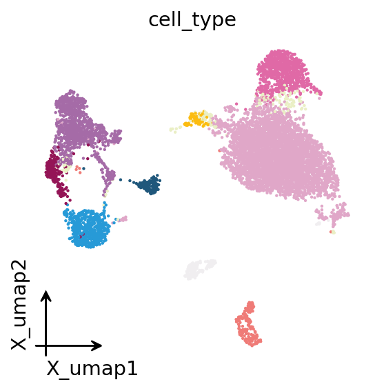
# Categorical embedding
fig, ax = plt.subplots(figsize=(4, 4))
ov.pl.embedding(
    adata,
    basis='X_umap',
    color='cell_type',
    #palette=color_dict,
    frameon='small',
    legend_loc=None,
    show=False,
    ax=ax,
)
save_figure_pair('figures/plotting/embedding_celltype')
plt.show()

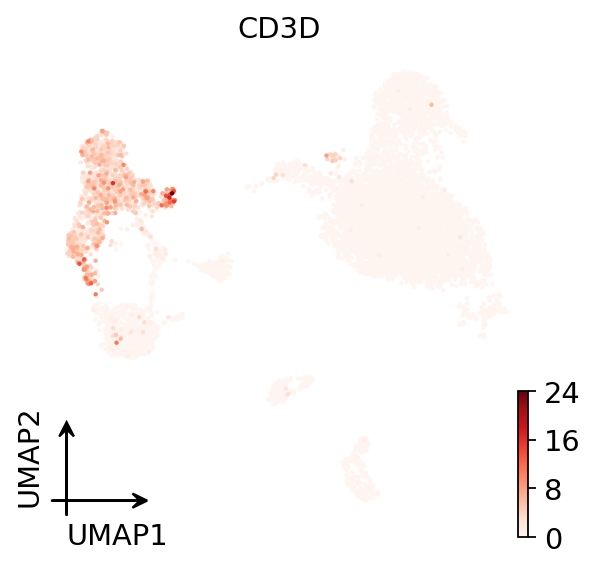
# Continuous embedding
fig, ax = plt.subplots(figsize=(4, 4))
ov.pl.umap(
    adata,
    color='CD3D',
    cmap='Reds',
    frameon='small',
    show=False,
    ax=ax,
)
save_figure_pair('figures/plotting/embedding_module_score')
plt.show()
X_umap converted to UMAP to visualize and saved to adata.obsm['UMAP']
if you want to use X_umap, please set convert=False
4. Use dotplots and violins to answer specific biological questions#
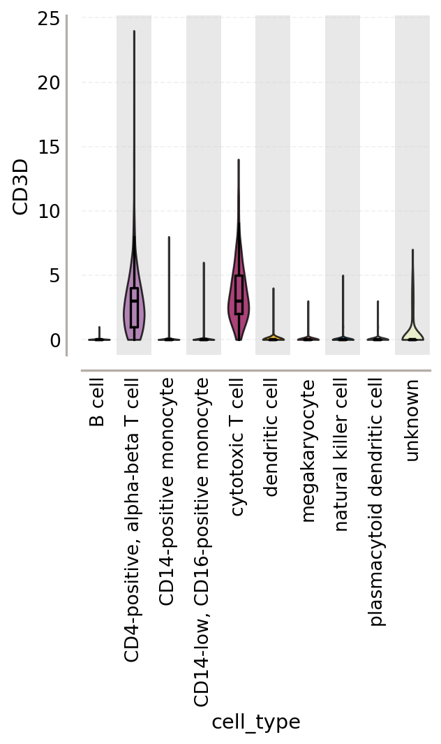
Embeddings are useful for overview, but they are weak for exact comparison. When you need to compare marker intensity, signature activity, or group differences, use summary plots.
Why this step matters:
dotplots compress many genes and groups into a readable panel
violin plots expose distribution shape instead of only mean signal
these plots provide stronger support for biological interpretation than embeddings alone
The goal is not to show more genes. The goal is to show the right genes with a clear group order.
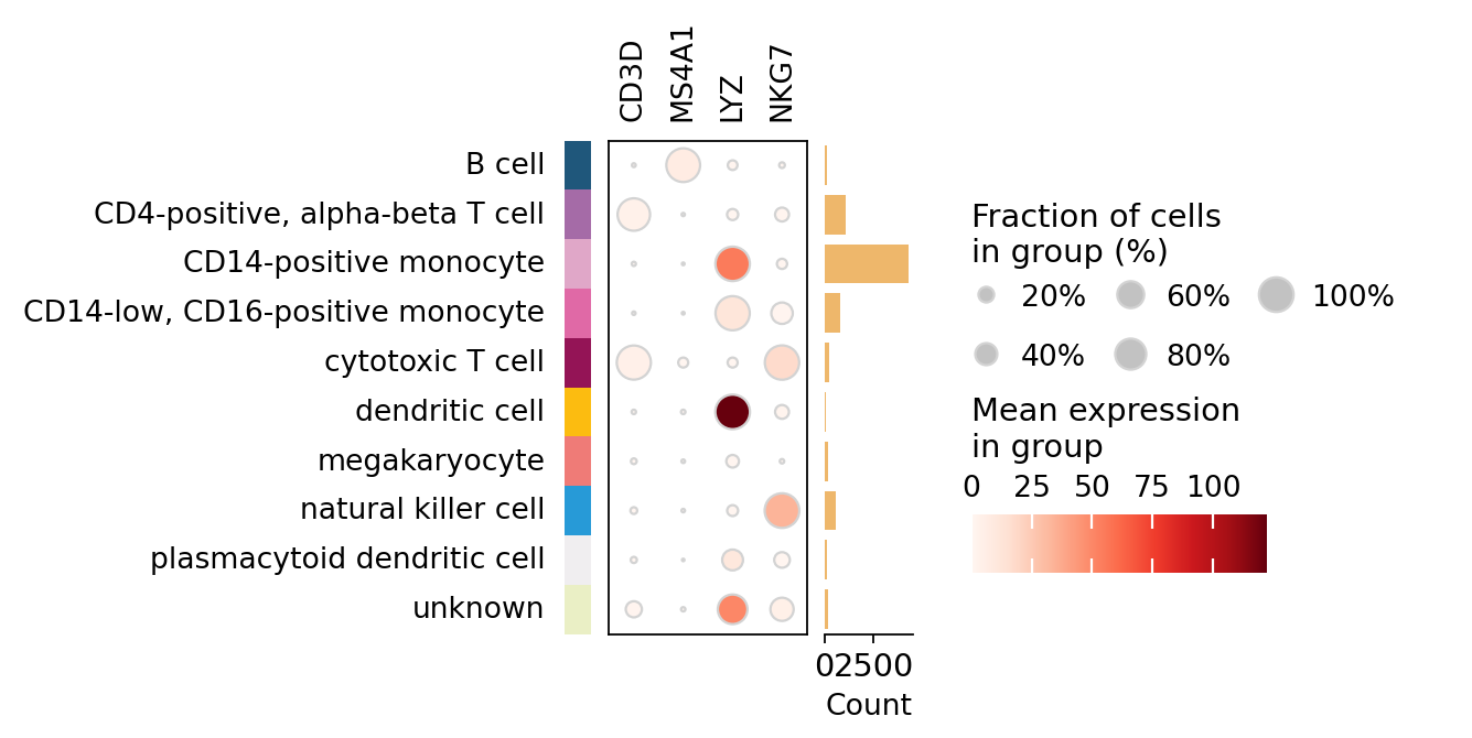
marker_genes = ['CD3D', 'MS4A1', 'LYZ', 'NKG7']

ov.pl.dotplot(
    adata,
    marker_genes,
    groupby='cell_type',
    cmap='Reds',
    figsize=(4, 4),
    show=False,
)
save_figure_pair('figures/plotting/dotplot_markers')
plt.show()

fig, ax = plt.subplots(figsize=(4, 4))
ov.pl.violin(
    adata,
    keys=['CD3D'],
    groupby='cell_type',
    rotation=90,
    stripplot=False,
    show=False,
    ax=ax,
    add_box=True
)
save_figure_pair('figures/plotting/violin_module_score')
plt.show()
5. Heatmaps should emphasize structure, not complexity#
Heatmaps are powerful because they reveal coordinated patterns across groups. They are also easy to overcomplicate.
Purpose of this step:
summarize structured differences across cell states, niches, or pathways
make trends visible at a glance
keep group-level interpretation readable
Recommended practice:
cluster only when clustering adds information
use diverging colormaps for centered values and sequential colormaps for abundance
keep labels readable before increasing matrix size
# Example matrix: rows are categories, columns are features/pathways.
# Replace with your own summary matrix.
# matrix = ...

# sns.clustermap(
#     matrix,
#     cmap='RdBu_r',
#     figsize=(8, 8),
#     center=0,
# )
# plt.savefig('figures/plotting/heatmap_signed.png', dpi=300, bbox_inches='tight')
# plt.savefig('figures/plotting/heatmap_signed.svg', dpi=300, bbox_inches='tight')
6. Spatial plots should preserve tissue context while remaining interpretable#
When plotting spatial transcriptomics or CosMx-style segmentation results, you should treat the image background as context, not as the main message.
Why this step matters:
too much segmentation detail hides biology
too much biological overlay hides tissue structure
readers should be able to see both location and pattern without visual overload
Practical rules:
keep panel shape close to square when possible
use compact layouts such as
(4, 4)for a single field of viewkeep contour lines and overlays visually subordinate
reuse the same category colors used in embeddings and summary plots
# Template for segmented spatial plotting — omicverse has this natively,
# so no squidpy import is needed. Adjust the keys to your own AnnData;
# pbmc8k has no spatial coordinates, so this stays a template here.

# ov.pl.spatial_segment(
#     adata,
#     seg_cell_id='cell_ID',
#     color='cell_type',
#     library_key='fov',
#     library_id='1',
#     palette=color_dict,
#     img=False,
#     figsize=(4, 4),
#     legend_loc=None,
#     frameon='small',
#     show=False,
# )
# save_figure_pair('figures/plotting/spatial_segment_celltype')

# For a cell-boundary overlay coloured by a second variable, see
# ov.pl.spatial_segment_overlay; for polygon-based segmentation masks,
# ov.pl.spatialseg.
7. Export for both analysis and publication#
Export is not a cosmetic afterthought. It determines whether your figure survives manuscript preparation.
Why save both formats:
pngis convenient for quick inspection, slides, and raster-based submissionssvgis better for vector editing, journal layout, and text sharpness
Why dpi=300 matters:
below this, labels and small symbols often degrade in print or PDF assembly
Why bbox_inches='tight' matters:
unnecessary margins complicate multi-panel composition
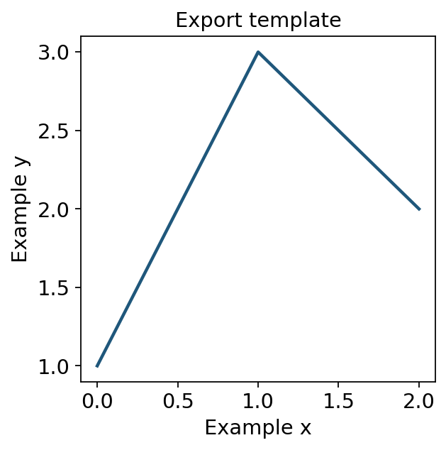
fig, ax = plt.subplots(figsize=(4, 4))
ax.plot([0, 1, 2], [1, 3, 2], lw=2)
ax.set_xlabel('Example x')
ax.set_ylabel('Example y')
ax.set_title('Export template')
save_figure_pair('figures/plotting/export_template')
plt.show()
8. Assemble the panels — ov.pl.multipanel#
Everything so far produced one plot at a time. A manuscript figure is a
composition: several panels, at a width the journal specified, with a /
b / c tags in the margin, exported once.
Doing that by hand means plt.subplots plus gridspec plus a hand-placed
ax.text per panel, and the tags drift the moment the figure is resized
because they are positioned in axes fractions. ov.pl.multipanel builds the
grid, tags the panels in reading order, and returns the axes keyed by the
letter printed on them — so a panel is referred to by what the reader sees.
Three things it does that a bare plt.subplots does not:
physical width, in mm / cm / inches / pixels, or by journal preset —
width='nature-double'is exactly 183 mmtags offset in typographic points, not axes fractions, so the same offset looks identical on a 40 mm and a 180 mm panel
mosaic layouts, where a panel spans several cells
Panels come back in a dict, so filling them is a loop or a lookup.
fig, axes = ov.pl.multipanel((2, 2), width='nature-single', height=75)
print('figure size:', (fig.get_size_inches() * 25.4).round(1), 'mm')
print('panel keys :', list(axes))
figure size: [89. 75.] mm
panel keys : ['a', 'b', 'c', 'd']
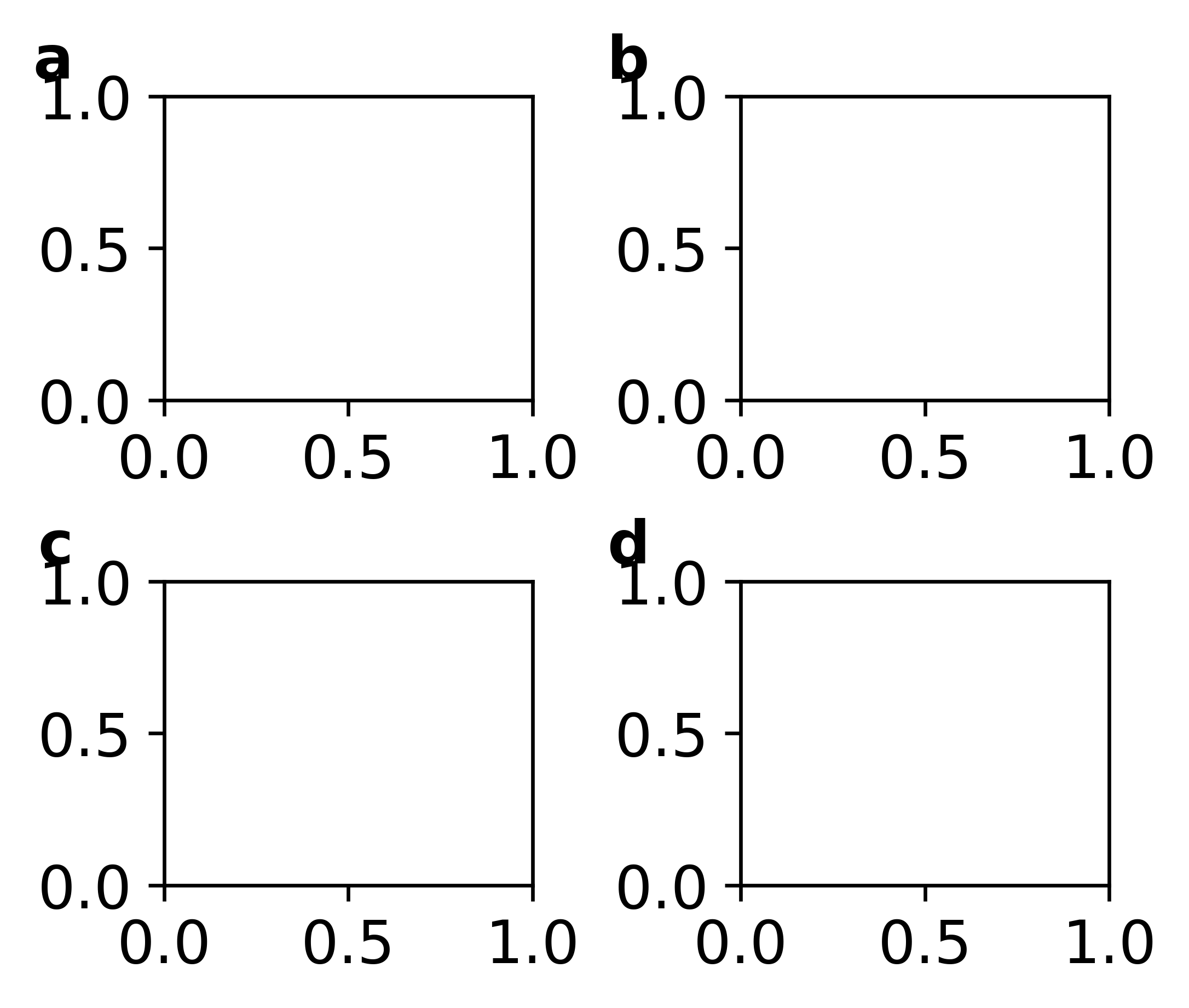
A 2 x 2 grid#
The showcase layout: four panels, equal size, tagged a-d in reading
order. Nothing is placed by hand.
# Short display names for the ontology labels, so tick labels stay readable.
SHORT = {
    'CD14-positive monocyte': 'CD14 Mono',
    'CD14-low, CD16-positive monocyte': 'CD16 Mono',
    'CD4-positive, alpha-beta T cell': 'CD4 T',
    'cytotoxic T cell': 'CD8 T',
    'natural killer cell': 'NK',
    'B cell': 'B',
    'plasmacytoid dendritic cell': 'pDC',
    'dendritic cell': 'DC',
    'megakaryocyte': 'Mk',
}
frame = pd.DataFrame({
    'cell_type': adata.obs['cell_type'].map(SHORT).astype(str).to_numpy(),
    'n_genes': np.asarray((adata.X > 0).sum(axis=1)).ravel().astype(float),
    'CD3D': np.log1p(ov.pl.get_values(adata, 'CD3D')),
    'NKG7': np.log1p(ov.pl.get_values(adata, 'NKG7')),
}, index=adata.obs_names)
main = frame[frame['cell_type'] != 'nan']
print(main.shape, '|', main['cell_type'].nunique(), 'labelled types')
main.head(3).round(2)
(7557, 4) | 9 labelled types
| cell_type | n_genes | CD3D | NKG7 | |
|---|---|---|---|---|
| TGAGCCGTCGATAGAA-1_10X_5-rep1 | CD14 Mono | 2208.0 | 0.0 | 0.0 |
| TACACGACAGGACGTA-1_10X_5-rep1 | CD14 Mono | 1828.0 | 0.0 | 0.0 |
| GAAGCAGCAGCTGTGC-1_10X_5-rep1 | CD14 Mono | 2822.0 | 0.0 | 0.0 |
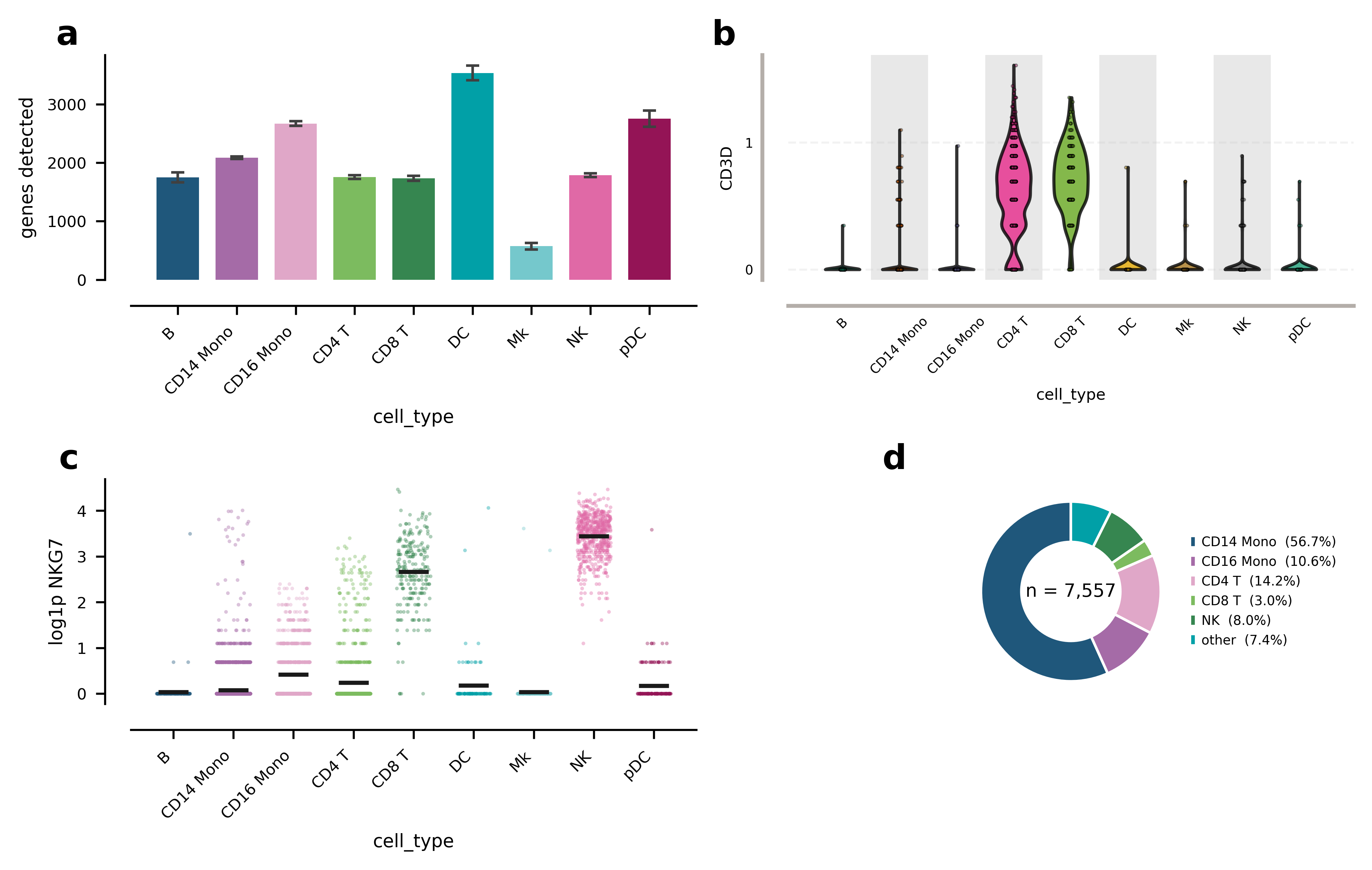
fig, ax = ov.pl.multipanel((2, 2), width='nature-double', height=115)
ov.pl.barplot(main, 'cell_type', 'n_genes', ax=ax['a'], rotation=45, fontsize=6,
              errorbar='ci', ylabel='genes detected')
ov.pl.violin(main, keys='CD3D', groupby='cell_type', ax=ax['b'], rotation=45, fontsize=6,
                 ylabel='log1p CD3D')
ov.pl.stripplot(main, 'cell_type', 'NKG7', ax=ax['c'], rotation=45, fontsize=6,
                size=2, jitter=0.28, alpha=0.4, ylabel='log1p NKG7')
ov.pl.donutplot(main, 'cell_type', ax=ax['d'], fontsize=5, legend=True,
                other_threshold=0.03)
plt.show()
pieplot: merged 4 categories below 3% into 'other': B, DC, Mk, pDC
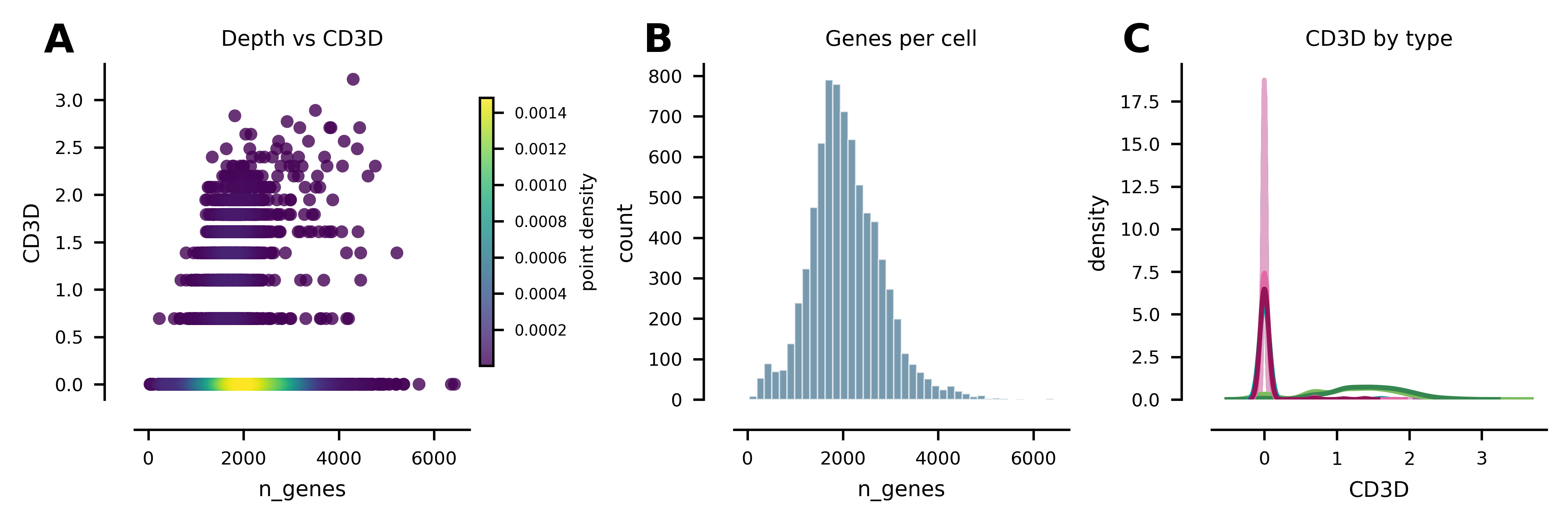
A 1 x 3 row, each panel titled#
A row is the layout for “three views of the same thing”. label='A' switches
to uppercase tags, which some journals require.
fig, ax = ov.pl.multipanel((1, 3), width=180, height=58, label='A')
ov.pl.scatterplot(frame, 'n_genes', 'CD3D', density=True, ax=ax['A'], fontsize=6)
ov.pl.histplot(frame, 'n_genes', bins=40, ax=ax['B'], fontsize=6)
ov.pl.kdeplot(main, 'CD3D', hue='cell_type', ax=ax['C'], fontsize=6, legend=False)
for key, title in zip('ABC', ('Depth vs CD3D', 'Genes per cell', 'CD3D by type')):
    ax[key].set_title(title, fontsize=7)
plt.show()
Unequal panels#
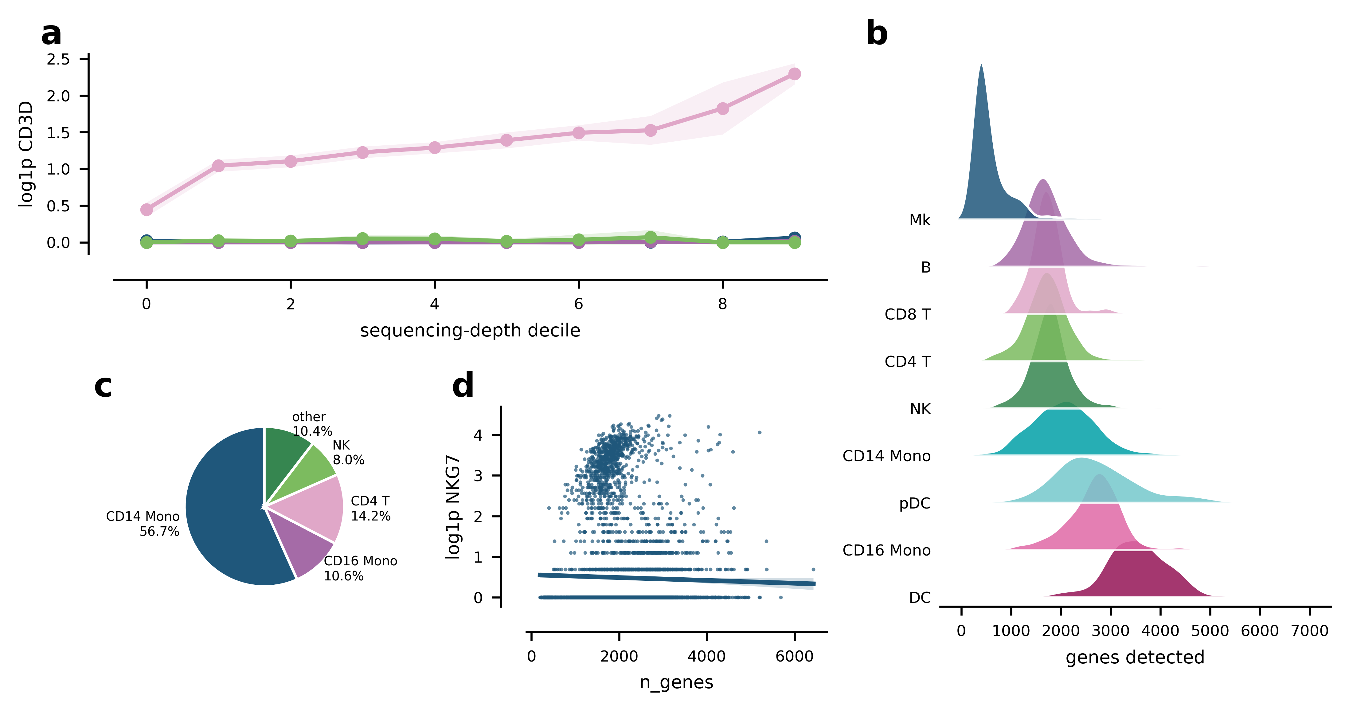
Real figures rarely divide evenly. width_ratios and height_ratios size the
tracks; a mosaic string lets a panel span cells, with . leaving a gap.
'AAB' / 'CDB' reads exactly as it looks: A spans the top-left two cells,
B spans the full height on the right, C and D sit underneath A.
Panels are reachable by the mosaic key or by the tag printed on them, so
ax['A'] and ax['a'] are the same axes here.
Note what panel a shows once lineplot is given a binned x: CD3D in CD4 T
cells climbs steadily with sequencing depth, while the non-T populations stay
flat at zero. That is a depth artefact, not biology — the kind of thing a
per-cell scatter hides and an aggregated trend with a confidence band makes
obvious.
# lineplot aggregates repeated measurements at each x, so give it a binned x
# rather than one point per cell — here, sequencing-depth deciles.
trend = main.copy()
trend['depth_decile'] = pd.qcut(trend['n_genes'], 10, labels=False)
big = trend['cell_type'].value_counts().head(4).index
trend = trend[trend['cell_type'].isin(big)]

fig, ax = ov.pl.multipanel('AAB\nCDB', width='nature-double', height=95,
                           width_ratios=[1, 1, 1.3], label='a')
ov.pl.lineplot(trend, 'depth_decile', 'CD3D', hue='cell_type', ax=ax['A'],
               errorbar='ci', markers=True, fontsize=6, legend=False,
               xlabel='sequencing-depth decile', ylabel='log1p CD3D')
ov.pl.ridgeplot(main, 'n_genes', 'cell_type', ax=ax['B'], fontsize=6,
                overlap=0.7, xlabel='genes detected')
ov.pl.pieplot(main, 'cell_type', ax=ax['C'], fontsize=5,
              label_style='percent', other_threshold=0.05)
ov.pl.regplot(main, 'n_genes', 'NKG7', ax=ax['D'], fontsize=6, s=2,
              annotate=False, ylabel='log1p NKG7')
plt.show()
pieplot: merged 5 categories below 5% into 'other': B, CD8 T, DC, Mk, pDC
Tagging a panel yourself#
ov.pl.add_panel_label places a single tag, offset from the axes corner in
points. That is the difference from the usual ax.text(-0.1, 1.05, 'a')
idiom: at 40 mm the axes-fraction version sits on top of the y-label, and at
180 mm it floats away. The point offset does neither.
ov.pl.take_legend_out moves a legend clear of the data instead of shrinking
it into a corner.
fig, ax = ov.pl.figure(120, 55, axes=True)
ov.pl.kdeplot(main, 'CD3D', hue='cell_type', ax=ax, fill=True, fontsize=7,
              legend=False)
ov.pl.add_panel_label(ax, 'e', dx=-30, dy=4)
ov.pl.take_legend_out(ax, loc='right', fontsize=6,
                      handles=ax.collections[:3],
                      labels=list(main['cell_type'].unique()[:3]))
plt.show()
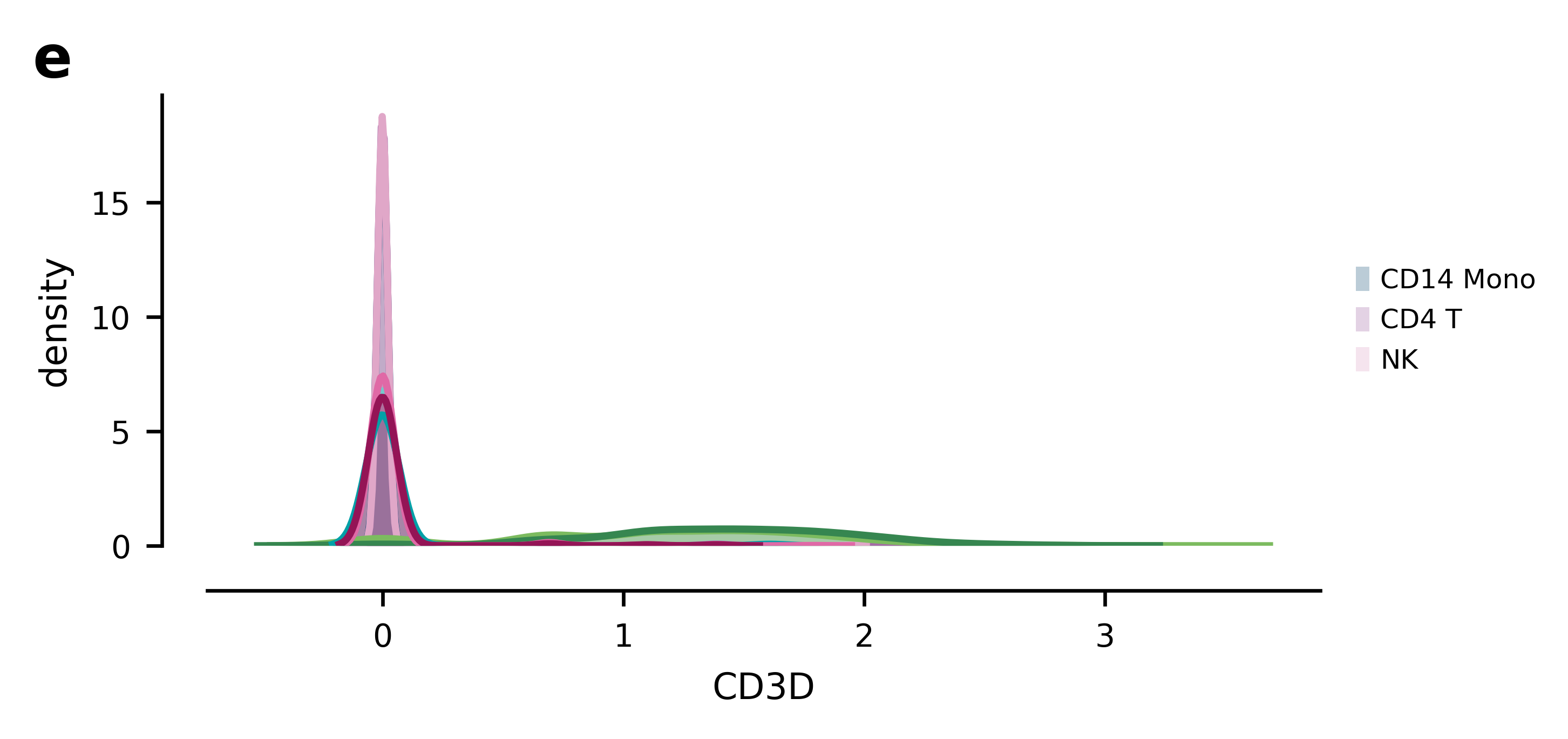
Figure 1, assembled and exported#
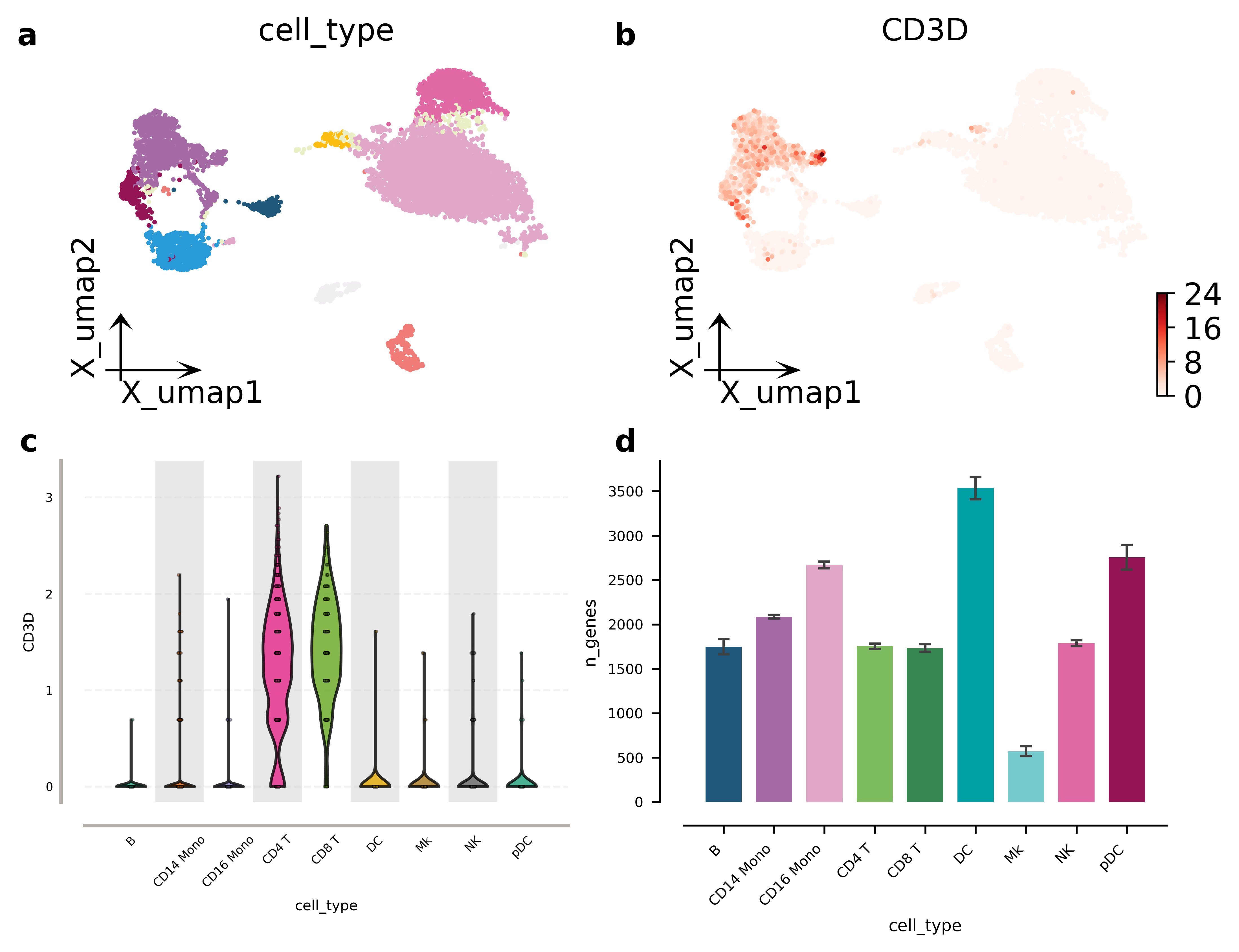
Putting it together with the omics panels from the earlier sections. The whole
composition is one figure object, so it exports in one call — and
ov.pl.savefig keeps the text as text in the SVG, which is what makes the
labels editable in Illustrator or Inkscape later.
Note bbox_inches=None: the default 'tight' crops to the drawn content,
which is convenient but silently changes the width you asked for. When a
journal specifies 183 mm, pass None and keep it.
fig, ax = ov.pl.multipanel('AB\nCD', width='nature-double', height=140)
ov.pl.embedding(adata, basis='X_umap', color='cell_type', frameon='small',
                legend_loc=None, show=False, ax=ax['a'])
ov.pl.embedding(adata, basis='X_umap', color='CD3D', cmap='Reds',
                frameon='small', show=False, ax=ax['b'])
ov.pl.violin(main, keys='CD3D', groupby='cell_type', ax=ax['c'], rotation=45, fontsize=6)
ov.pl.barplot(main, 'cell_type', 'n_genes', ax=ax['d'], rotation=45, fontsize=6,
              errorbar='ci')
plt.show()
paths = ov.pl.savefig(fig, 'figures/plotting/figure1',
                      formats=['pdf', 'svg', 'png'], dpi=300,
                      bbox_inches=None)
svg = open('figures/plotting/figure1.svg').read()
print('width kept       :', (fig.get_size_inches()[0] * 25.4).round(1), 'mm')
print('SVG has <text>   :', '<text' in svg)
print('a label is a str :', 'cell_type' in svg)
Saved: figures/plotting/figure1.pdf, figures/plotting/figure1.svg, figures/plotting/figure1.png
width kept       : 183.0 mm
SVG has <text>   : True
a label is a str : True
One difference from cnsplots worth knowing if you are coming from it: its
multipanel is a flow builder — you call mp.panel('A', 70, 70) and give
every panel its own pixel size, and panels wrap when they reach max_width.
ov.pl.multipanel is a grid/mosaic builder: the figure has one physical
size and the panels divide it, with width_ratios / height_ratios and
spanning for the uneven cases.
The grid model reproduces every layout in the cnsplots showcase (they are all
regular grids), composes with any function that accepts ax=, and stays a
plain matplotlib figure. What it does not express is “panel A is exactly
70 x 70 mm regardless of its neighbours” — if you need that, build the panel
with ov.pl.figure and place it with fig.add_axes.
9. A practical checklist before you finalize a figure#
Before a figure enters a manuscript, verify the following:
Biological meaning is clear: the plot answers one question well.
Category colors are stable: the same cell type is not recolored in another panel.
Colormap logic is correct: sequential for abundance, diverging for signed contrasts.
Text is readable: labels are not oversized, but they also do not disappear after export.
Panel geometry is consistent: similar figures use similar figure sizes.
Legends are under control: present when needed, suppressed when redundant.
Export is complete: both
pngandsvgare saved withdpi=300.The figure can stand alone: title, axis labels, and color interpretation are understandable without code.
If a figure fails any of these checks, improve the figure before generating more figures.
Summary#
A good scientific figure in omicverse is not defined by complexity. It is defined by consistency, semantic color usage, appropriate plot choice, and clean export.
A useful working order is:
define global style
fix categorical palettes
choose the correct continuous colormap
make the overview plot
make the evidence plot
export in paired formats
Once you standardize these steps, your plotting workflow becomes faster, more reproducible, and much easier to maintain across a full project.