Multivariate discrimination with PLS-DA and OPLS-DA#
The previous tutorial (t_metabol_01_intro.ipynb) ran a per-metabolite univariate test. That tells you which metabolites differ when considered alone — but metabolomics data is correlated (pathways share substrates, NMR peaks overlap, coregulated metabolites move together). Multivariate methods use those correlations to find the combination of metabolites that best separates groups, which is typically a stronger biological signal than any single-metabolite hit.
This tutorial covers:
PCA — unsupervised baseline (built into AnnData as
ov.pp.pca)PLS-DA — supervised projection maximizing group separation
OPLS-DA (Trygg & Wold 2002) — isolates the predictive direction from orthogonal variance
VIP scores — which features drive the separation
S-plot — the canonical OPLS-DA interpretation plot
Q² and R² — how to assess model quality
Dataset: same cachexia NMR as notebook 1 (77 samples × 63 metabolites).
import matplotlib.pyplot as plt
import numpy as np
import pandas as pd

import omicverse as ov

ov.plot_set()
🔬 Starting plot initialization...
🧬 Detecting GPU devices…
✅ NVIDIA CUDA GPUs detected: 1
    • [CUDA 0] NVIDIA H100 80GB HBM3
      Memory: 79.1 GB | Compute: 9.0

   ____            _     _    __
  / __ \____ ___  (_)___| |  / /__  _____________
 / / / / __ `__ \/ / ___/ | / / _ \/ ___/ ___/ _ \
/ /_/ / / / / / / / /__ | |/ /  __/ /  (__  )  __/
\____/_/ /_/ /_/_/\___/ |___/\___/_/  /____/\___/

🔖 Version: 2.1.2rc1   📚 Tutorials: https://omicverse.readthedocs.io/
✅ plot_set complete.
1 — Load and preprocess#
We reuse the same canonical order from notebook 1: PQN → log → Pareto. PQN corrects for dilution, log stabilizes variance, and Pareto scaling centers + scales each feature while damping (not eliminating) high-variance features’ influence. The result is the input to every multivariate model below.
csv_path = ov.datasets.download_data(
    url='https://rest.xialab.ca/api/download/metaboanalyst/human_cachexia.csv',
    file_path='human_cachexia.csv',
    dir='./metabol_data',
)
adata = ov.metabol.read_metaboanalyst(csv_path, group_col='Muscle loss')
adata = ov.metabol.normalize(adata, method='pqn')
adata = ov.metabol.transform(adata, method='log')
adata = ov.metabol.transform(adata, method='pareto', stash_raw=False)
print(adata, '  | group split:', adata.obs['group'].value_counts().to_dict())
🔍 Downloading data to ./metabol_data/human_cachexia.csv
⚠️ File ./metabol_data/human_cachexia.csv already exists
AnnData object with n_obs × n_vars = 77 × 63
    obs: 'group'
    uns: 'metabol'
    layers: 'raw'   | group split: {'cachexic': 47, 'control': 30}
2 — Why multivariate before univariate#
Correlated features are the norm in metabolomics: closely-related amino acids covary because they share transamination enzymes; TCA cycle intermediates covary because they interconvert. A univariate test evaluates each feature independently and pays a multiple-testing penalty proportional to the number of metabolites — which is extra steep when features are redundant.
A multivariate projection (PCA, PLS-DA, OPLS-DA) pools the correlated features into latent components. The group-separation signal that was spread thin across 10 correlated amino acids now concentrates in a single component, which can pass FDR correction even when none of the individual features did.
This is especially relevant for cachexia: the top-10 univariate hits from notebook 1 have padj > 0.05 for most entries, but we’ll see multivariate methods give a clear group separation with Q² > 0 (real predictive signal).
3 — PCA baseline (unsupervised)#
Principal Component Analysis is the simplest multivariate method — it picks directions of highest variance in the data, ignoring the group labels. If the biology is the dominant signal, PC1/PC2 will separate groups; if not, it means technical variance (batch, run order) or another biological factor is stronger than case vs control.
Use ov.pp.pca — the same PCA used throughout omicverse for single-cell. Pareto-scaled metabolite data is the input.
from sklearn.decomposition import PCA
pcs = PCA(n_components=5).fit_transform(adata.X)
fig, ax = plt.subplots(figsize=(4.5, 4))
for grp, marker in zip(sorted(adata.obs['group'].unique()), 'os'):
    mask = (adata.obs['group'] == grp).values
    ax.scatter(pcs[mask, 0], pcs[mask, 1], marker=marker, label=grp,
               s=36, alpha=0.8, edgecolor='black', linewidth=0.5)
ax.set(xlabel='PC1', ylabel='PC2', title='PCA of cachexia NMR (unsupervised)')
ax.legend(frameon=False); plt.tight_layout(); plt.show()
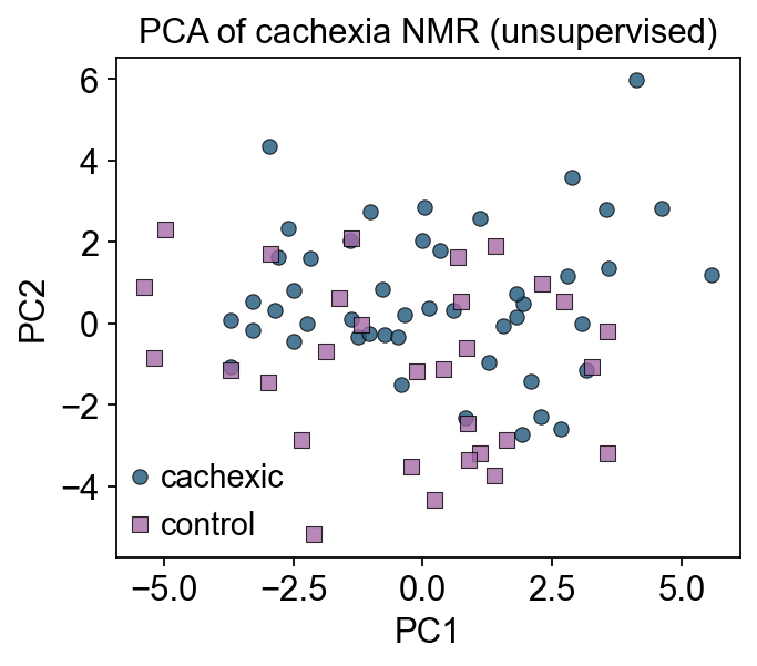
Groups overlap on PC1/PC2 — the dominant variance in the data isn’t case vs control. That’s typical; untargeted metabolomics is dominated by inter-individual biological variation. Hence the need for a supervised projection (PLS-DA / OPLS-DA) that explicitly optimizes group separation.
4 — PLS-DA#
Partial Least Squares Discriminant Analysis finds latent components of X that maximize covariance with Y (the binary group label). Think of it as PCA rotated toward the Y axis.
ov.metabol.plsda wraps scikit-learn’s PLSRegression and adds a PLSDAResult object carrying scores, loadings, VIP, and standard quality metrics.
Parameters#
Argument |
Meaning |
Typical value |
|---|---|---|
|
number of latent components |
2 for visualization; determine by cross-validated Q² for prediction |
|
autoscale features inside sklearn PLS |
|
|
which two groups to contrast (if more than two exist) |
the two unique values |
What the result contains#
Attribute |
Shape |
Meaning |
|---|---|---|
|
|
the sample’s coordinate on each latent axis |
|
|
each feature’s contribution to each component |
|
|
Variable Importance in Projection — see §5 |
|
float |
fraction of X-variance explained |
|
float |
fraction of Y-variance explained |
|
float |
leave-one-out cross-validated R² — the honest metric |
pls = ov.metabol.plsda(adata, group_col='group', n_components=2, scale=False)
print(f'R²X (X-variance explained): {pls.r2x:.3f}')
print(f'R²Y (Y-variance explained): {pls.r2y:.3f}')
print(f'Q²  (leave-one-out CV)     : {pls.q2:.3f}    ← positive means model beats mean-prediction')
R²X (X-variance explained): 0.124
R²Y (Y-variance explained): 0.615
Q²  (leave-one-out CV)     : 0.112    ← positive means model beats mean-prediction
fig, ax = plt.subplots(figsize=(4.5, 4))
for grp, marker in zip(pls.group_labels, 'os'):
    mask = (adata.obs['group'] == grp).values
    ax.scatter(pls.scores[mask, 0], pls.scores[mask, 1], marker=marker, label=grp,
               s=36, alpha=0.85, edgecolor='black', linewidth=0.5)
ax.set(xlabel=f't[1] (R²X={pls.r2x:.3f})',
       ylabel='t[2]',
       title=f'PLS-DA — Q²={pls.q2:.3f}')
ax.legend(frameon=False); plt.tight_layout(); plt.show()
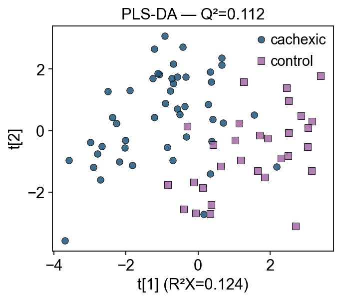
Compared to the PCA plot, PLS-DA now separates groups along t[1]. But the separation is somewhat diluted — there’s still within-group variance on both axes because PLS-DA bundles group-relevant and group-irrelevant variance into the same components. OPLS-DA fixes that.
5 — OPLS-DA — splitting predictive from orthogonal variance#
Orthogonal PLS-DA (Trygg & Wold 2002, J. Chemometrics) factors X-variance into two pieces:
One predictive component — correlated with Y (group label)
n_orthoorthogonal components — variance in X that is uncorrelated with Y (batch effects, within-group biology)
Result: a single, interpretable predictive axis. The loadings + VIP on that axis directly answer “which metabolites drive group separation”, without the group-irrelevant variance bleeding into the interpretation.
Choosing n_ortho#
n_ortho=1is the safe default for two-group studies.Increase if your data has strong technical structure (multiple batches, sex-dependent variance). A 7×7 permutation test on Q² per
n_orthois the rigorous way; for tutorials just use 1.Too many orthogonal components overfit and inflate Q².
opls = ov.metabol.opls_da(adata, group_col='group', n_ortho=1, scale=False)
print(f'R²X: {opls.r2x:.3f}')
print(f'R²Y: {opls.r2y:.3f}   ← much higher than PLS-DA above')
print(f'Q² : {opls.q2:.3f}   ← leave-one-out CV')
print(f'predictive component shape: {opls.scores.shape}')
print(f'orthogonal component shape: {opls.x_ortho_scores.shape}')
R²X: 0.046
R²Y: 0.615   ← much higher than PLS-DA above
Q² : 0.112   ← leave-one-out CV
predictive component shape: (77, 1)
orthogonal component shape: (77, 1)
# Plot the predictive vs orthogonal scores — the signature OPLS-DA view
fig, ax = plt.subplots(figsize=(4.8, 4))
for grp, marker in zip(opls.group_labels, 'os'):
    mask = (adata.obs['group'] == grp).values
    ax.scatter(opls.scores[mask, 0], opls.x_ortho_scores[mask, 0], marker=marker,
               label=grp, s=36, alpha=0.85, edgecolor='black', linewidth=0.5)
ax.axvline(0, c='grey', lw=0.7)
ax.set(xlabel='t[1] — predictive (group separation)',
       ylabel='t[o1] — orthogonal (within-group variance)',
       title=f'OPLS-DA — R²Y={opls.r2y:.3f}, Q²={opls.q2:.3f}')
ax.legend(frameon=False); plt.tight_layout(); plt.show()
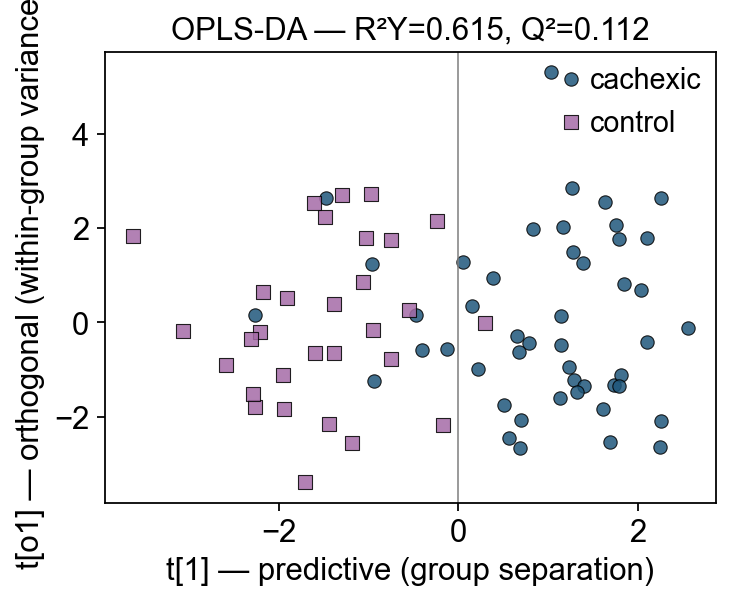
Cachexic patients fall to one side of t[1] = 0; controls to the other. The orthogonal axis t[o1] captures within-group spread — metabolically heterogeneous patients are spread vertically but still separable horizontally.
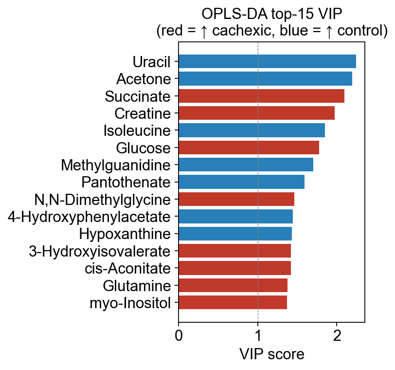
6 — VIP scores — which metabolites drive separation#
Variable Importance in Projection (Wold 1995) is the single most-cited metric for picking biomarker candidates out of a PLS-DA / OPLS-DA model.
where \(w_{ja}\) is the feature weight on component \(a\), \(q_a\) is the Y-loading on that component, and \(K\) is the number of features. The normalization implies the average VIP is 1; features with VIP > 1 are conventionally considered “above-average importance”. For strict biomarker selection some groups use VIP > 1.5 or VIP > 2.
VIP and univariate p-value are complementary:
Low p-value + high VIP → robust biomarker
Low p-value + low VIP → univariate hit that doesn’t survive when correlations are considered
High p-value + high VIP → multivariate signal spread across correlated features — usually still interesting
vip_tbl = opls.to_vip_table(adata.var_names)
vip_tbl.head(15)
                             vip      coef
Uracil                  2.244291 -0.139887
Acetone                 2.194668 -0.136794
Succinate               2.096273  0.130661
Creatine                1.974690  0.123082
Isoleucine              1.847803 -0.115174
Glucose                 1.777980  0.110821
Methylguanidine         1.704463 -0.106239
Pantothenate            1.590449 -0.099133
N,N-Dimethylglycine     1.461826  0.091116
4-Hydroxyphenylacetate  1.442693 -0.089923
Hypoxanthine            1.429550 -0.089104
3-Hydroxyisovalerate    1.421744  0.088617
cis-Aconitate           1.421663  0.088612
Glutamine               1.374319  0.085661
myo-Inositol            1.371508  0.085486
# The VIP bar plot with coef-sign coloring (red = ↑ in group_a, blue = ↑ in group_b)
fig, ax = ov.metabol.vip_bar(opls, adata.var_names, top_n=15)
ax.set_title(f'OPLS-DA top-15 VIP\n(red = ↑ {opls.group_labels[0]}, blue = ↑ {opls.group_labels[1]})')
plt.tight_layout(); plt.show()
7 — S-plot — the canonical interpretation plot#
S-plot (Wiklund et al. 2008, Anal Chem) is the publication-standard way to interpret OPLS-DA loadings. It’s a scatter of:
x-axis:
p(cov)— covariance between each feature and the predictive component. Magnitude = how strongly the feature contributes to group separation.y-axis:
p(corr)— correlation between feature and predictive component. Reliability — is the covariance a consistent signal or a high-variance outlier effect?
Features in the two outer arms of the S shape have both high covariance and high correlation — those are the biomarker candidates that are both strong and robust. Features near the origin contribute little; features with high p(cov) but low p(corr) are driven by outlier samples.
ov.metabol.s_plot plots that by coloring each dot by its VIP score, so you can see overlay of all three interpretation signals on one figure.
fig, ax = ov.metabol.s_plot(opls, adata, label_top_n=10)
ax.set_title('OPLS-DA S-plot — axes: covariance (x) vs correlation (y) with predictive component')
plt.tight_layout(); plt.show()
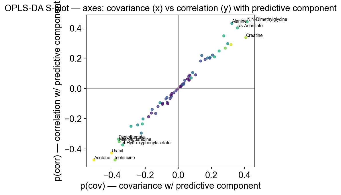
The “arms” of the S are populated by the same metabolites the univariate analysis flagged plus several new ones (correlated amino acid groups etc.) — this is the main reason to run OPLS-DA alongside the univariate test: it surfaces multivariate signals that don’t show up as single-feature hits.
8 — Best-practice caveats#
Never run OPLS-DA on the training set and report training R²Y — it’s always near 1.0 and meaningless. Use Q² (leave-one-out or k-fold). We show that automatically.
Permutation test Q² before publishing — 1000 label-permutations, build the null distribution of Q².
ov.metabolwill add apermute_q2helper in v0.3; for now use the reported Q² as a reasonable but not rigorous sanity check.Q² is not R² — a Q² of 0.1-0.3 with strong group separation is normal for 60-100-metabolite NMR studies. Insisting on Q² > 0.5 will make you throw away biologically interesting data. Interpret alongside class separation on the score plot.
One-vs-rest for >2 groups — OPLS-DA is inherently a two-group method. For 3+ groups use OPLS-DA pairwise or switch to standard PLS-DA with indicator variables.
Summary#
Method |
Unsupervised? |
What it maximizes |
When to use |
|---|---|---|---|
PCA ( |
✓ |
X-variance |
first look, QC |
PLS-DA |
✗ |
cov(X, Y) over |
fast discriminant projection |
OPLS-DA |
✗ |
cov(X, Y) on 1 predictive + n_ortho orthogonal |
interpretability, S-plot, VIP |
Next: t_metabol_03_pathway.ipynb — now that we have significant metabolites and VIP lists, how do we translate them into biological pathways? ID mapping + MSEA.