
Reading FCS, compensation and display scales#
Cytometry is a modality, not a sub-analysis of single-cell RNA-seq. An event is a cell, but nothing else transfers: the file format is FCS, the values a detector reports are contaminated by every other fluorochrome in the panel, and the axis you look at is a nonlinear display scale that has to be carried around with the data or every gate drawn on it becomes meaningless.
ov.flow covers those three things, and this notebook is about all three:
reading —
ov.io.read_fcs, and what lands in theAnnDatacompensation — undoing spillover between detectors
display transforms — logicle / hyperlog / asinh, and why a log axis is not an option
Two later notebooks build on this one: gating and saving a strategy.
A sample to work on#
Everything below runs on ov.datasets.flow_demo_fcs(), which writes a
simulated FCS file, so there is nothing to download. It is the only
generated dataset in ov.datasets; everything else there is real published
data, and the docstring says so loudly for a reason.
Simulated on purpose rather than as a convenience. A real FCS file cannot teach
compensation, because once you only have the file the uncompensated truth is
gone — you cannot show what the spillover did. Here the true fluorescence is
known, the spillover is applied deliberately, and the before and after can sit
side by side. The same goes for gating: obs['population'] carries which
population each event really came from, so a gate can be checked against the
answer instead of against how the plot looks. Real data never comes with that
column, which is the entire difficulty of the field.
It also carries a detector noise floor that pushes dim events below zero — not a detail, but the whole reason the display scales at the end of this notebook exist.
# No data of your own is needed. ov.datasets.flow_demo_fcs() writes a SIMULATED
# FCS 3.1 file into the current working directory: 59,600 events, nine known
# populations, a real $SPILLOVER keyword, and a detector noise floor that pushes
# dim events below zero — which is why a log display axis will not do.
import numpy as np, pathlib
import omicverse as ov

ov.style()          # omicverse's plotting defaults — call this once, up front

path = ov.datasets.flow_demo_fcs()
print(path)
🔬 Starting plot initialization...
🧬 Detecting GPU devices…
✅ Apple Silicon MPS detected
    • [MPS] Apple Silicon GPU - Metal Performance Shaders available

   ____            _     _    __
  / __ \____ ___  (_)___| |  / /__  _____________
 / / / / __ `__ \/ / ___/ | / / _ \/ ___/ ___/ _ \
/ /_/ / / / / / / / /__ | |/ /  __/ /  (__  )  __/
\____/_/ /_/ /_/_/\___/ |___/\___/_/  /____/\___/

🔖 Version: 2.2.4   📚 Tutorials: https://omicverse.readthedocs.io/
✅ plot_set complete.

flow_demo.fcs
Reading#
ov.io.read_fcs is I/O, so it lives in ov.io — ov.flow never becomes a
second reader. Events become observations, channels become variables.
adata = ov.io.read_fcs(path)
adata
AnnData object with n_obs × n_vars = 59600 × 8
    obs: 'sample'
    var: 'n', 'channel', 'marker', 'PnB', 'PnE', 'PnG', 'PnR'
    uns: 'meta', 'fcs'
The var table keeps both names. A cytometer records a detector
(FITC-A); a person thinks in markers (CD3). Losing either one breaks
something: gates written by a collaborator name detectors, and figures name
markers.
var is indexed by the marker where the file gave one, with the detector kept
in a column — and both resolve to the same data everywhere in ov.flow.
adata.var
           n   channel     marker   PnB         PnE  PnG       PnR
FSC-A      1     FSC-A             None  (0.0, 0.0)  1.0  262144.0
FSC-H      2     FSC-H             None  (0.0, 0.0)  1.0  262144.0
SSC-A      3     SSC-A             None  (0.0, 0.0)  1.0  262144.0
CD3        4    FITC-A        CD3  None  (0.0, 0.0)  1.0  262144.0
CD4        5      PE-A        CD4  None  (0.0, 0.0)  1.0  262144.0
CD19       6   PerCP-A       CD19  None  (0.0, 0.0)  1.0  262144.0
CD8        7     APC-A        CD8  None  (0.0, 0.0)  1.0  262144.0
Viability  8  Zombie-A  Viability  None  (0.0, 0.0)  1.0  262144.0
ov.datasets.flow_demo() is exactly the two lines above — write the file,
read it back — plus one thing a real file could never carry: obs['population'],
the population each event was actually drawn from. The rest of this series uses
it so a gate can be checked against the answer.
adata = ov.datasets.flow_demo()
adata.obs["population"].value_counts()
population
CD4 T      17000
debris     11000
CD8 T      10000
B           7500
mono        5200
doublet     3800
dead        3200
DN T        1400
DP T         500
Name: count, dtype: int64
Spillover#
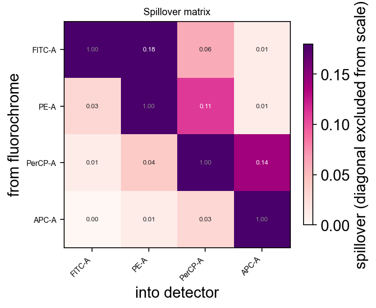
Every fluorochrome emits into detectors other than its own. The file records
how much, as a matrix; ov.io.read_fcs parses it into uns['fcs']['spillover'].
The diagonal is 1.0 by construction and is left out of the colour scale — with it in, every off-diagonal value, which is the entire content of the matrix, gets squeezed into the bottom few percent of the colour map.
ov.flow.spillover_heatmap(adata)
None
What spillover does to a plot#
This is the part worth seeing rather than reading. Uncompensated, FITC (CD3) leaking into the PE (CD4) detector produces a diagonal smear: every CD3+ event appears to be slightly CD4+, in exact proportion to how bright it is in CD3. It looks exactly like a real population of double-positive cells, and it is not one.
import matplotlib.pyplot as plt

lg = ov.flow.Logicle(t=262144.0, m=4.5, w=1.0, a=0.0)

raw = adata.copy()          # keep an uncompensated copy for the comparison
ov.flow.compensate(adata)   # uses uns['fcs']['spillover'] — the file's own matrix

fig, axes = plt.subplots(1, 2, figsize=(9.2, 4.2))
ov.flow.biaxial(raw,   "CD3", "CD4", transforms={"CD3": lg, "CD4": lg},
                ax=axes[0], title="uncompensated", max_events=40000)
ov.flow.biaxial(adata, "CD3", "CD4", transforms={"CD3": lg, "CD4": lg},
                ax=axes[1], title="compensated", max_events=40000)
plt.tight_layout()
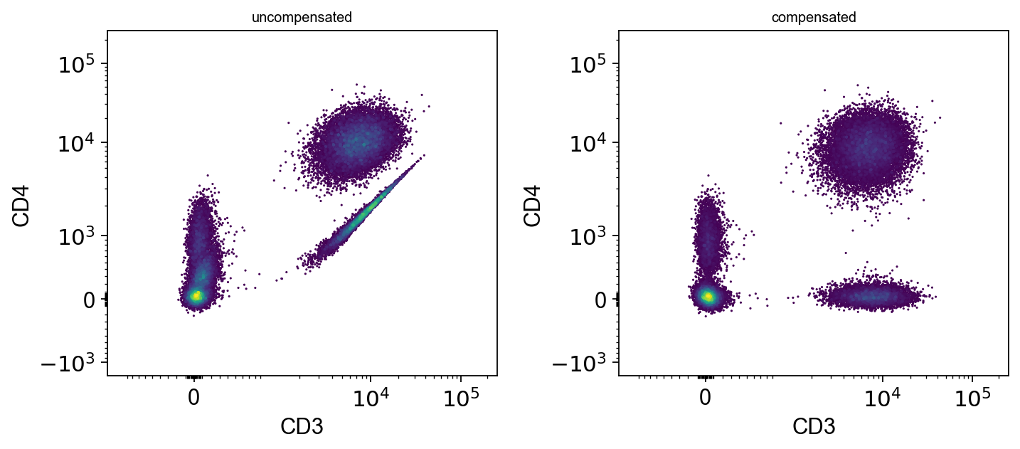
The smear collapses into a horizontal population sitting at zero CD4 — which is what CD3+CD8+ T cells actually are.
The same thing as a number, on populations that are genuinely CD3-negative and therefore cannot be CD4-bright:
import numpy as np

cd3_negative = adata.obs["population"].isin(["B", "debris", "mono"]).to_numpy()
i_cd4 = list(adata.var.index).index("CD4")

print(f"CD4 median in CD3-negative populations")
print(f"  uncompensated : {np.median(raw.X[cd3_negative, i_cd4]):7.0f}")
print(f"  compensated   : {np.median(adata.X[cd3_negative, i_cd4]):7.0f}")
CD4 median in CD3-negative populations
  uncompensated :     188
  compensated   :      53
compensate records what it did in uns['flow'] and keeps the
original matrix as a layer, so the operation is auditable and cannot silently
happen twice.
print(adata.uns["flow"]["compensated"], "|", list(adata.layers))
try:
    ov.flow.compensate(adata)
except Exception as e:
    print(f"{type(e).__name__}: {e}")
True | ['uncompensated']
ValueError: this object is already compensated. Compensating twice is silently destructive — the numbers stay plausible — so it has to be explicit: re-read the file if you meant to apply a different matrix.
Display scales#
Compensation is arithmetic; the display scale is what you look at. And a compensated channel contains negative values — subtracting spillover from a dim event routinely lands below zero, and so does the detector’s own noise:
cd3 = adata[:, "CD3"].X.ravel()
print(f"CD3 events at or below zero: {(cd3 <= 0).sum():,} / {cd3.size:,} "
      f"({(cd3 <= 0).mean():.1%})")
print(f"minimum value: {cd3.min():.0f}")
CD3 events at or below zero: 6,784 / 59,600 (11.4%)
minimum value: -189
That single number rules out a log axis: log10 of a negative number
does not exist, so 11% of the events would silently vanish — including
exactly the dim events a threshold gate has to be drawn between.
A biexponential scale — logicle, hyperlog — is linear near zero and logarithmic away from it, so it displays the whole range on one axis. Compare the three on the same channel:
fig, axes = plt.subplots(1, 3, figsize=(13, 2.8))
for ax, tr, name in zip(
        axes,
        [ov.flow.Linear(t=262144.0), ov.flow.Log(t=262144.0, m=4.5), lg],
        ["Linear", "Log", "Logicle"]):
    ov.flow.histogram(adata, "CD3", transforms={"CD3": tr}, ax=ax, title=name)
plt.tight_layout()
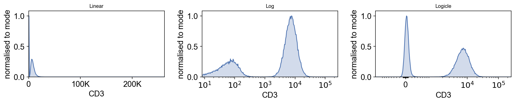
Linear crushes four decades of biology into the left edge. Log spreads the positives out but cannot represent the negative population at all — that peak is simply gone. Logicle keeps both.
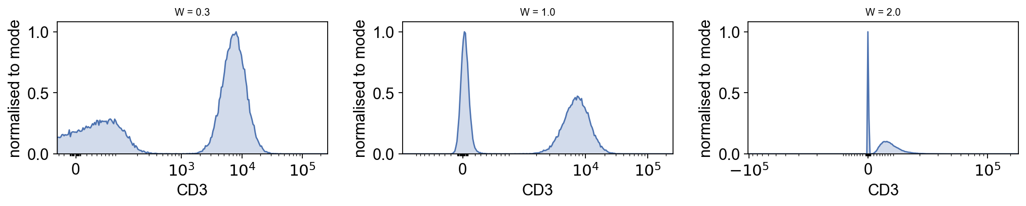
The W parameter is the whole decision#
W sets how wide the linear region is, in decades. Too small and the negative
population is compressed into a spike at the axis edge; too large and the
positives lose resolution. It is the one logicle parameter worth tuning by
eye — which means looking at it:
fig, axes = plt.subplots(1, 3, figsize=(13, 2.8))
for ax, w in zip(axes, [0.3, 1.0, 2.0]):
    tr = ov.flow.Logicle(t=262144.0, m=4.5, w=w, a=0.0)
    ov.flow.histogram(adata, "CD3", transforms={"CD3": tr}, ax=ax,
                      title=f"W = {w}")
plt.tight_layout()
A transform is a serialisable object, not a function, precisely so it can be stored next to the gate whose boundary was drawn on it:
lg.to_dict()
{'type': 'logicle', 't': 262144.0, 'w': 1.0, 'm': 4.5, 'a': 0.0}
What is next#
The gate is where all of this is going. A polygon drawn on a logicle axis and the same vertices read as linear values describe completely different populations — so in the next notebook every gate carries the transform it was drawn on.