Visualization of Bulk RNA-seq#
In this part, we will introduce the tutorial of special plot of omicverse.
import omicverse as ov
import scanpy as sc
import matplotlib.pyplot as plt
ov.plot_set()
____            _     _    __
  / __ \____ ___  (_)___| |  / /__  _____________
 / / / / __ `__ \/ / ___/ | / / _ \/ ___/ ___/ _ \
/ /_/ / / / / / / / /__ | |/ /  __/ /  (__  )  __/
\____/_/ /_/ /_/_/\___/ |___/\___/_/  /____/\___/

Version: 1.5.8, Tutorials: https://omicverse.readthedocs.io/
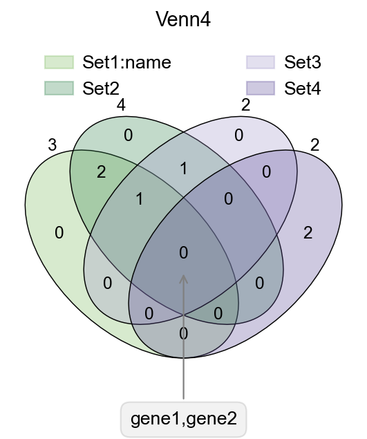
Venn plot#
In transcriptome analyses, we often have to study differential genes that are common to different groups. Here, we provide ov.pl.venn to draw venn plots to visualise differential genes.
Function: ov.pl.venn:
sets: Subgroups requiring venn plots, Dictionary format, keys no more than 4
palette: You can also re-specify the colour bar that needs to be drawn, just set
palette=['#FFFFFF','#000000'], we have preparedov.pl.red_color,ov.pl.blue_color,ov.pl.green_color,ov.pl.orange_color, by default.fontsize: the fontsize and linewidth to visualize, fontsize will be multiplied by 2
fig,ax=plt.subplots(figsize = (4,4))
#dict of sets
sets = {
    'Set1:name': {1,2,3},
    'Set2': {1,2,3,4},
    'Set3': {3,4},
    'Set4': {5,6}
}
#plot venn
ov.pl.venn(sets=sets,palette=ov.pl.sc_color,
           fontsize=5.5,ax=ax,
           )


#If we need to annotate genes, we can use plt.annotate for this purpose,
#we need to modify the text content, xy and xytext parameters.
plt.annotate('gene1,gene2', xy=(50,30), xytext=(0,-100),
             ha='center', textcoords='offset points',
             bbox=dict(boxstyle='round,pad=0.5', fc='gray', alpha=0.1),
             arrowprops=dict(arrowstyle='->', color='gray'),size=12)

#Set the title
plt.title('Venn4',fontsize=13)

#save figure
fig.savefig("figures/bulk_venn4.png",dpi=300,bbox_inches = 'tight')
Text(0, -100, 'gene1,gene2')
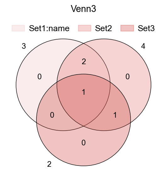
fig,ax=plt.subplots(figsize = (4,4))
#dict of sets
sets = {
    'Set1:name': {1,2,3},
    'Set2': {1,2,3,4},
    'Set3': {3,4},
}

ov.pl.venn(sets=sets,ax=ax,fontsize=5.5,
           palette=ov.pl.red_color)

plt.title('Venn3',fontsize=13)
Text(0.5, 1.0, 'Venn3')
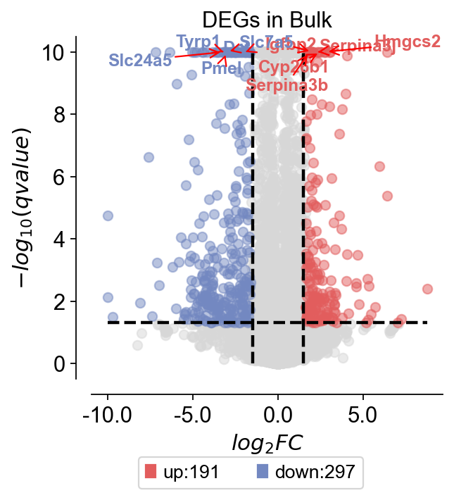
Volcano plot#
For differentially expressed genes, we tend to visualise them only with volcano plots. Here, we present a method for mapping volcanoes using Python ov.pl.volcano.
Function: ov.pl.venn:
main argument
result: the DEGs result
pval_name: the names of the columns whose vertical coordinates need to be plotted, stored in result.columns. In Bulk RNA-seq experiments, we usually set this to qvalue.
fc_name: The names of the columns for which you need to plot the horizontal coordinates, stored in result.columns. In Bulk RNA-seq experiments, we typically set this to log2FC.
fc_max: We need to set the threshold for the difference foldchange
fc_min: We need to set the threshold for the difference foldchange
pval_threshold: We need to set the threshold for the qvalue
pval_max: We also need to set boundary values so that the data is not too large to affect the visualisation
FC_max: We also need to set boundary values so that the data is not too large to affect the visualisation
plot argument
figsize: The size of the generated figure, by default (4,4).
title: The title of the plot, by default ‘’.
titlefont: A dictionary of font properties for the plot title, by default {‘weight’:’normal’,’size’:14,}.
up_color: The color of the up-regulated genes in the plot, by default ‘#e25d5d’.
down_color: The color of the down-regulated genes in the plot, by default ‘#7388c1’.
normal_color: The color of the non-significant genes in the plot, by default ‘#d7d7d7’.
legend_bbox: A tuple containing the coordinates of the legend’s bounding box, by default (0.8, -0.2).
legend_ncol: The number of columns in the legend, by default 2.
legend_fontsize: The font size of the legend, by default 12.
plot_genes: A list of genes to be plotted on the volcano plot, by default None.
plot_genes_num: The number of genes to be plotted on the volcano plot, by default 10.
plot_genes_fontsize: The font size of the genes to be plotted on the volcano plot, by default 10.
ticks_fontsize: The font size of the ticks, by default 12.
result=ov.read('data/dds_result.csv',index_col=0)
result.head()
| baseMean | log2FoldChange | lfcSE | stat | pvalue | padj | qvalue | -log(pvalue) | -log(qvalue) | BaseMean | log2(BaseMean) | log2FC | abs(log2FC) | sig | |
|---|---|---|---|---|---|---|---|---|---|---|---|---|---|---|
| 4931428F04Rik | 44.747673 | -0.592738 | 0.680476 | -0.871063 | 0.383720 | 0.650810 | 0.650810 | 0.415986 | 0.186545 | 44.747673 | 5.515626 | -0.592738 | 0.592738 | normal |
| Fam135a | 1679.272500 | 0.065358 | 0.269188 | 0.242797 | 0.808163 | 0.922122 | 0.922122 | 0.092501 | 0.035211 | 1679.272500 | 10.714479 | 0.065358 | 0.065358 | normal |
| Cxcl5 | 18.194110 | 0.391243 | 0.954836 | 0.409749 | 0.681990 | 0.859639 | 0.859639 | 0.166222 | 0.065684 | 18.194110 | 4.262592 | 0.391243 | 0.391243 | normal |
| Gm2830 | 85.257000 | 0.960027 | 0.363169 | 2.643472 | 0.008206 | 0.047828 | 0.047828 | 2.085866 | 1.320314 | 85.257000 | 6.430570 | 0.960027 | 0.960027 | normal |
| Stat2 | 821.361600 | -0.409115 | 0.448145 | -0.912907 | 0.361292 | 0.630416 | 0.630416 | 0.442142 | 0.200373 | 821.361600 | 9.683629 | -0.409115 | 0.409115 | normal |
ov.pl.volcano(result,pval_name='qvalue',fc_name='log2FoldChange',
                     pval_threshold=0.05,fc_max=1.5,fc_min=-1.5,
                      pval_max=10,FC_max=10,
                    figsize=(4,4),title='DEGs in Bulk',titlefont={'weight':'normal','size':14,},
                     up_color='#e25d5d',down_color='#7388c1',normal_color='#d7d7d7',
                     up_fontcolor='#e25d5d',down_fontcolor='#7388c1',normal_fontcolor='#d7d7d7',
                     legend_bbox=(0.8, -0.2),legend_ncol=2,legend_fontsize=12,
                     plot_genes=None,plot_genes_num=10,plot_genes_fontsize=11,
                     ticks_fontsize=12,)
<AxesSubplot: title={'center': 'DEGs in Bulk'}, xlabel='$log_{2}FC$', ylabel='$-log_{10}(qvalue)$'>
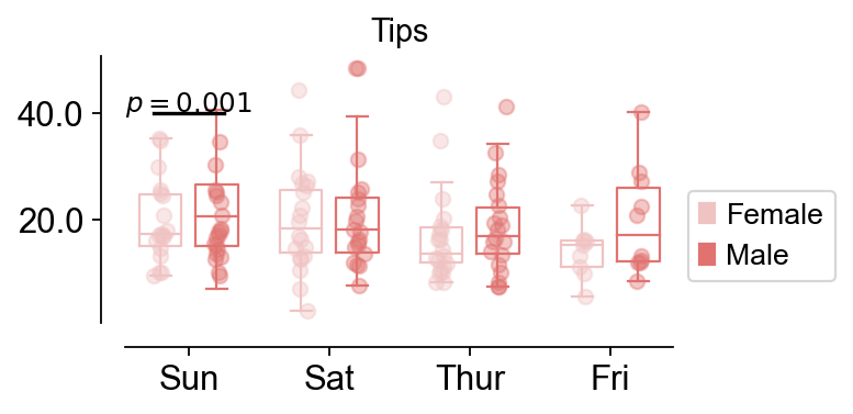
Box plot#
For differentially expressed genes in different groups, we sometimes need to compare the differences between different groups, and this is when we need to use box-and-line plots to do the comparison
Function: ov.pl.boxplot:
data: the data to visualize the boxplt example could be found in
seaborn.load_dataset("tips")x_value, y_value, hue: Inputs for plotting long-form data. See examples for interpretation.
figsize: The size of the generated figure, by default (4,4).
fontsize: The font size of the tick and labels, by default 12.
title: The title of the plot, by default ‘’.
Function: ov.pl.add_palue:
ax: the axes of bardotplot
line_x1: The left side of the p-value line to be plotted
line_x2: The right side of the p-value line to be plotted|
line_y: The height of the p-value line to be plotted
text_y: How much above the p-value line is plotted text
text: the text of p-value, you can set
***to insteadp<0.001fontsize: the fontsize of text
fontcolor: the color of text
horizontalalignment: the location of text
import seaborn as sns
data = sns.load_dataset("tips")
data.head()
| total_bill | tip | sex | smoker | day | time | size | |
|---|---|---|---|---|---|---|---|
| 0 | 16.99 | 1.01 | Female | No | Sun | Dinner | 2 |
| 1 | 10.34 | 1.66 | Male | No | Sun | Dinner | 3 |
| 2 | 21.01 | 3.50 | Male | No | Sun | Dinner | 3 |
| 3 | 23.68 | 3.31 | Male | No | Sun | Dinner | 2 |
| 4 | 24.59 | 3.61 | Female | No | Sun | Dinner | 4 |
fig,ax=ov.pl.boxplot(data,hue='sex',x_value='day',y_value='total_bill',
              palette=ov.pl.red_color,
              figsize=(4,2),fontsize=12,title='Tips',)

ov.pl.add_palue(ax,line_x1=-0.5,line_x2=0.5,line_y=40,
          text_y=0.2,
          text='$p={}$'.format(round(0.001,3)),
          fontsize=11,fontcolor='#000000',
          horizontalalignment='center',)